Leading Words: From the change in the proportion of color in the third quarter, it can be seen that the achromatic color system is decreasing year by year, while the non-ferrous color system is increasing in small increments. Among them, the purple, blue, green, and orange colors are of particular concern, which was relatively high in previous years. Red has fallen back, but we also recommend a color system.
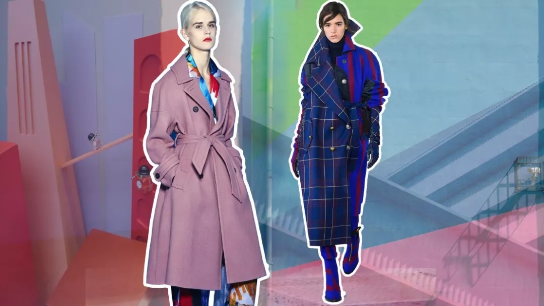
From the change in the proportion of color in the third quarter, it can be seen that the achromatic color system gradually decreases year by year, while the non-ferrous color system shows a small increase. Among them, purple, blue, green, and orange are particularly noticeable. After the fall, our focus is also recommended to have a color system.
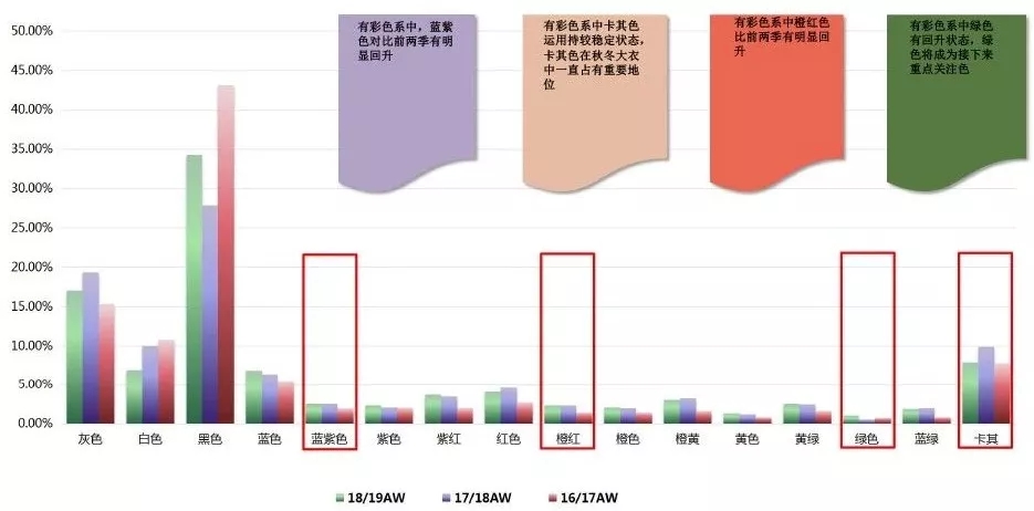
Purple Ratio Data Analysis
From the data analysis of autumn/winter season from 16/17 autumn/winter season to 18/19 autumn/winter season, the purple color of light fog obviously decreased and the purple color of appendix rose obviously.
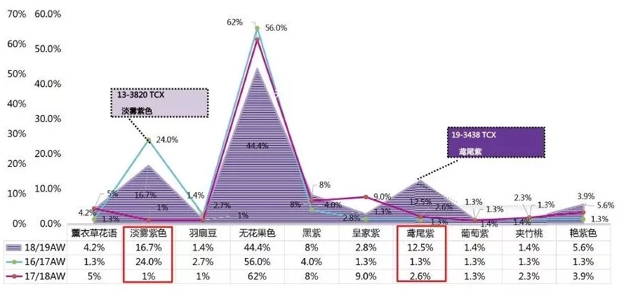
Recommended color 1 - light fog purple
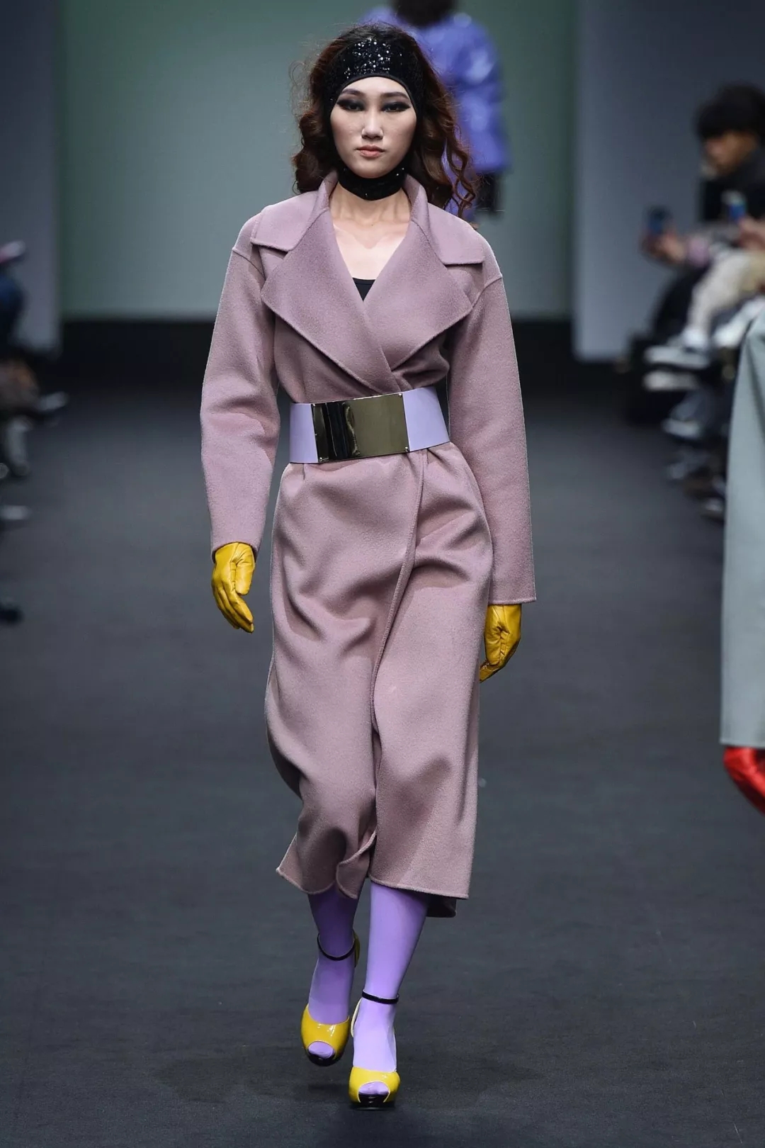
From the analysis of three quarters of the data, the light fog purple has a tendency to decline, but the major show fields are still doing light fog purple. It is used for Asian skin color, and the soft color sense is prominent in the style of less lady and elegant style design.
Saint Mill
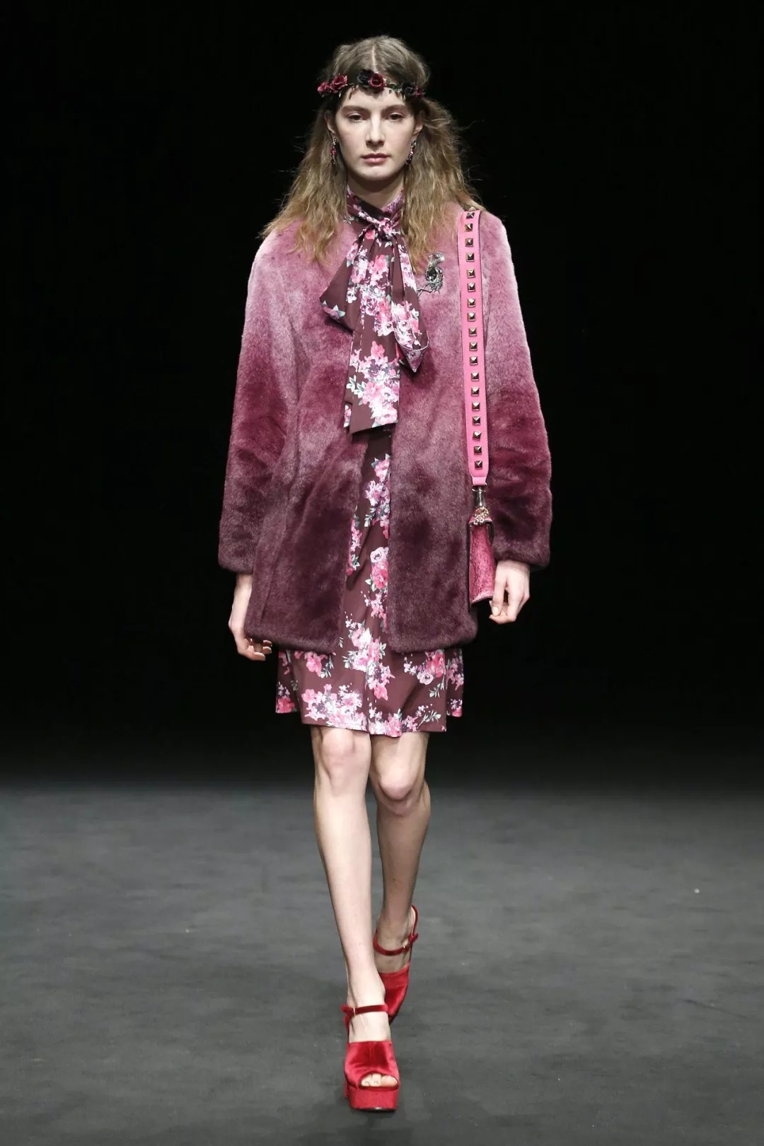
Lola Casademunt
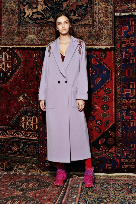
Christian Pellizzari
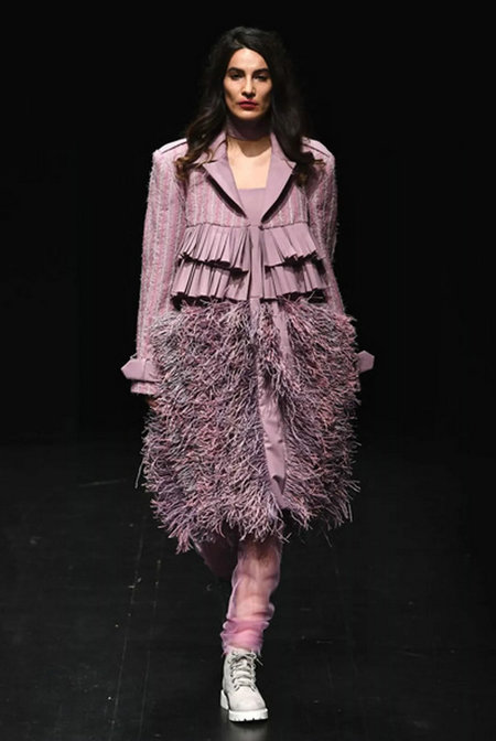
Neslihan Comez
Recommended color 2 - iris purple
Shanwei violet is a synonym for gracefulness and splendidness. It is also a common color used by European courts. For example, the patterns used in European home furnishings are commonly used in this color. There is also a synonym for the goddess Alice. Here is a gorgeous purple design style for street tidal winds. , brings a sense of collision, and the color matching, recommended with the current heat has been increasing the yellow and green colors, the use of more prominent brands is Versace and its Deputy varsus, the use is to join the black or white, let the color Department of weakening the impact of purple, while the inclusion of contrasting yellow, so that the color with a more lively, but also can be used as a color purple, using the gradient form of performance.
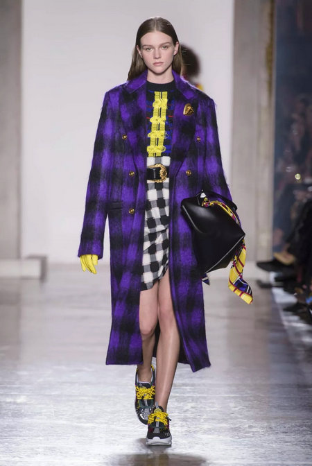
Versace
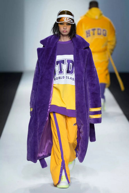
Solo Celeb.& Htdg
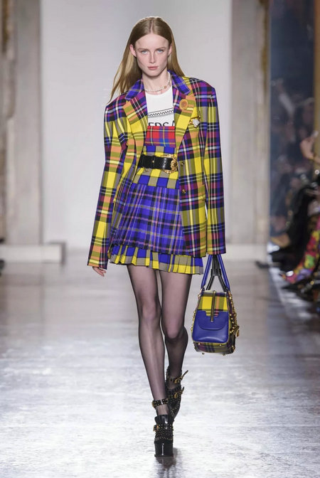
Versace
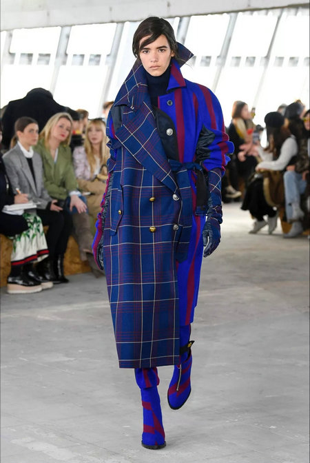
Sacai
Analysis of the proportion of purple color data
In the fuchsia system, the use of Burgundy burgundy is in a downward trend, and the dahlias, which are brighter in color, account for a very high proportion of colors in autumn and winter, and are also the most important colors. The new color recommended this time is Aurora. Powder, reflecting the brand's increasingly younger design attitude.
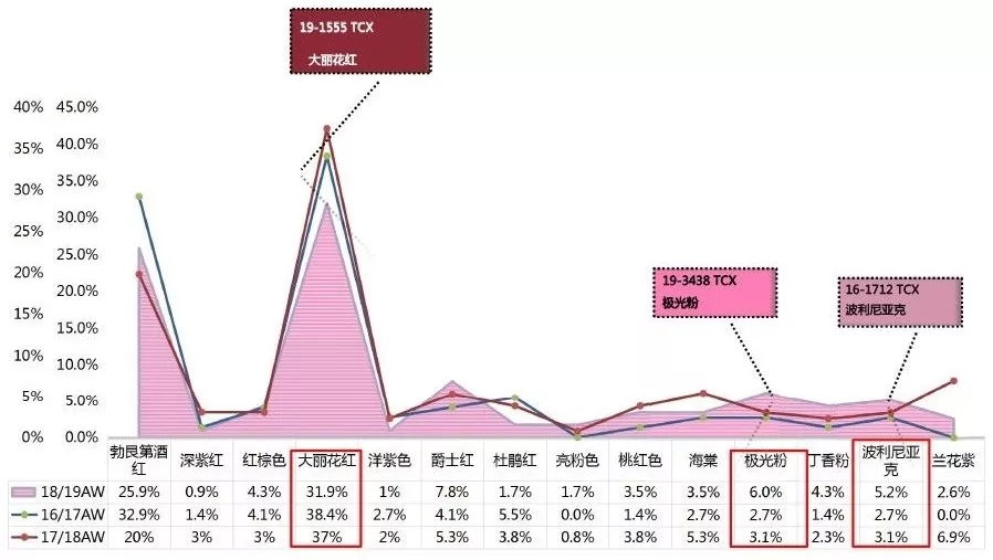
The main push color - Aurora powder
Will find that the recommended brand of Aurora Powder use, whether it is a mature British style Burberry or Italian style Dolce & Gabbana, or Shao Shu brand Blugirl, etc. have different manifestations, and the same application technique is that the Aurora powder will be compared Bright, using cool blue, green as embellishment, embossed with embroidery or printing, burning, and other techniques combined to make Aurora powder not too shocking.
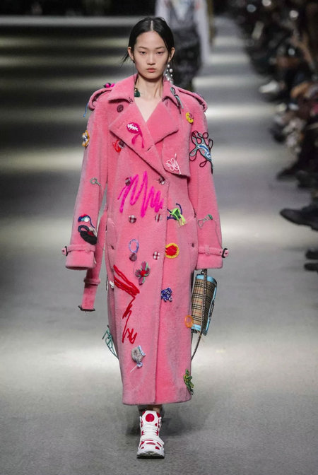
Burberry
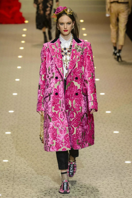
Dolce & Gabbana
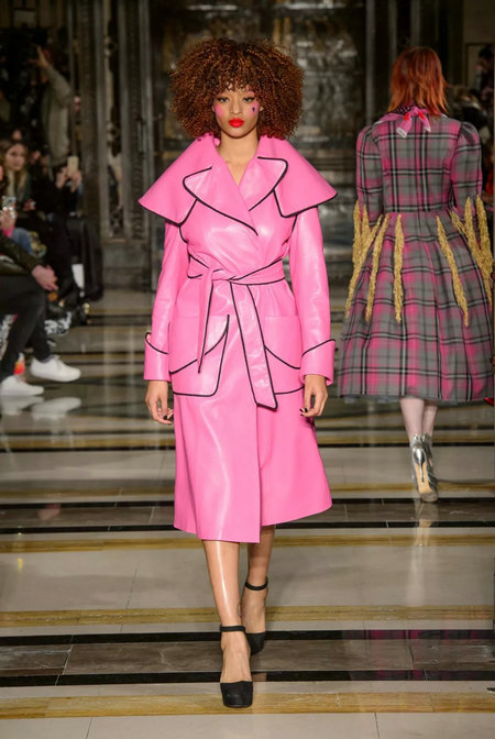
Pam Hogg
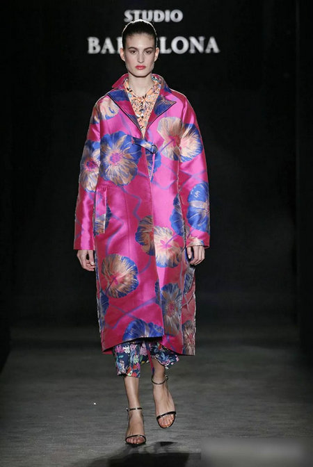
Escorpion Studio Barcelona
Warm color data accounting analysis
In the warm color system, red has always used an extremely high proportion of colors each year. For example, in the previous year, the popular national flag was red, and last year, the red heat dropped back, and the yellowish orange color of the off-point yellow gradually became outcropped. This was also due to the prevalence of sporty winds. It also has an impact on the promotion of this color system. At the same time, the hot color of caramel in spring and summer also makes the proportion of coffee color or environment more and more high, so our main push clay red.
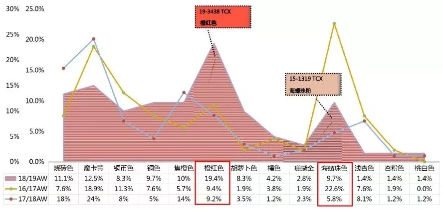
Recommended color 1 - Conch beads
The mutual transformation between neutral colors and stylish colors becomes important seasonal information. Powder waxes are maturing, showing simplicity and refinement. The conch beads pink presents a girl's dream and ambiguity, which is a must for ladies.
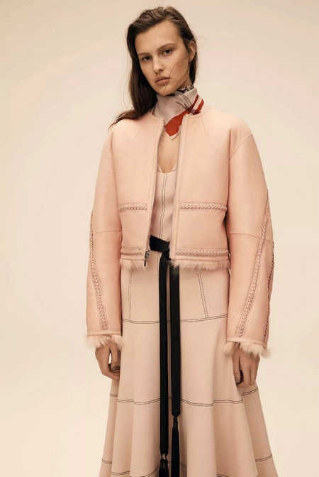
Amanda Wakeley
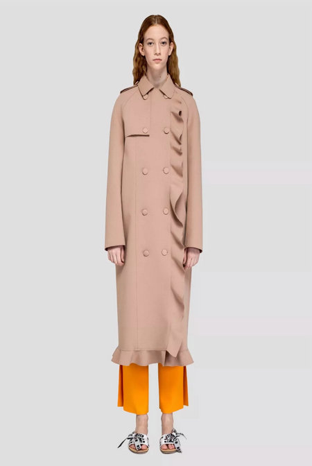
MSGM
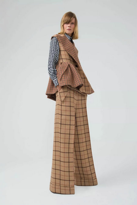
Dice Kayek
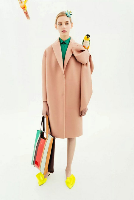
Delpozo
Recommended color 2 - orange red
The orange-red color is lighter than the brick red, more caramel than the caramel, belongs to grayscale red color, and has higher applicability. It can be applied very well in sports outdoor or in Chinese and Simplified. It is recommended that the monochrome design method be used. These citrus tones are no longer limited to sports and outdoor outlines, flowing across the season warmth, highlighting eye-catching, dynamic qualities.
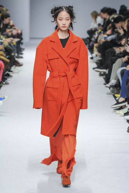
KYE
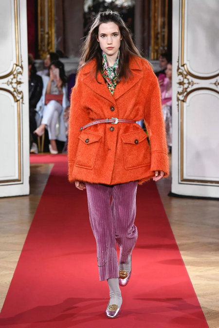
Paul & Joe
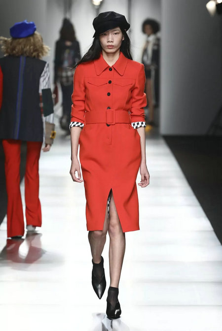
Youwei
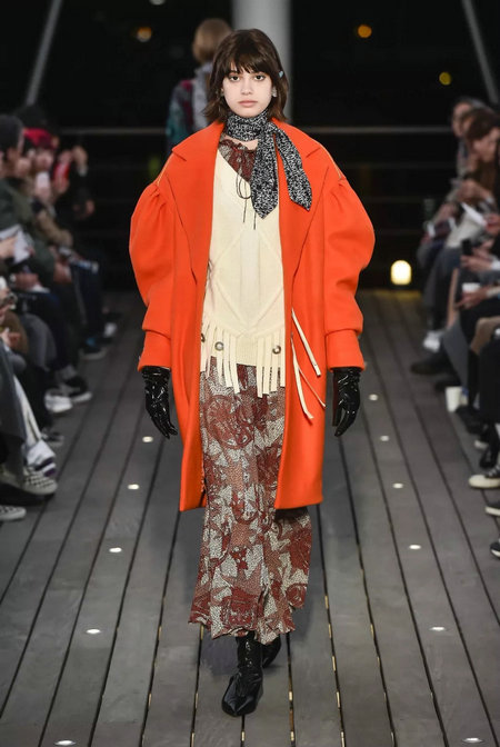
5-KNOT
Blue data analysis
Blue is a commonly used color for autumn and winter, in which deep blue and deep blue have always accounted for a high proportion in the use of coat color, which is also a common color in the past years. From the data, it can also be seen that the lighter bluebell grass color rises significantly.
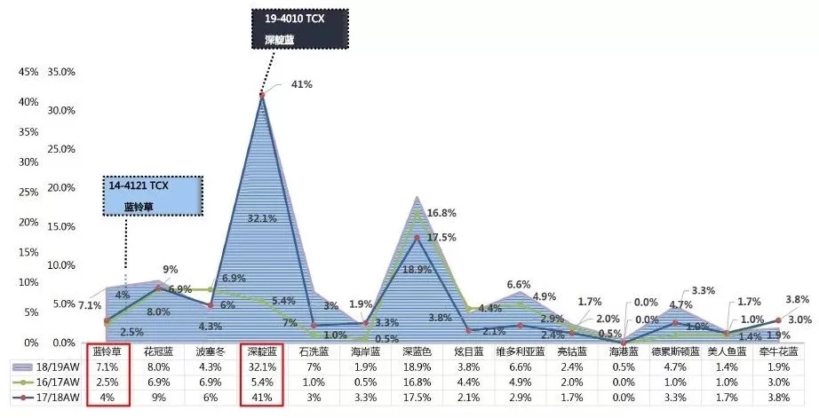
The main push color - bluebell grass
Recommended color in the blue color - bluebell grass color, this color brightness is high, saturation is low, more comfortable and light, no age limit, but also mention skin color, suitable for Asian women, and the same expression as the bluebell flower language: bright and elegant , expressing healthy and tender love; forecasting this color will be a bright spot in the coat design of autumn and winter.
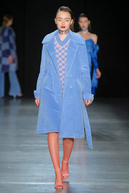
Daizy Shely
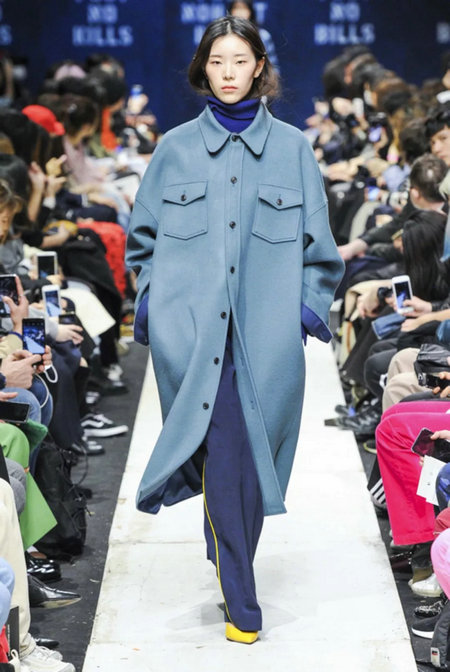
ONHANT
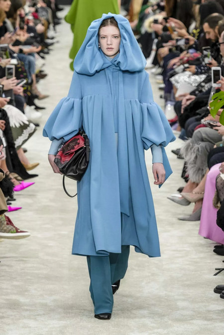
Valentino
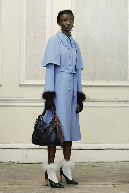
Mulberry
Green Data Analysis
From the color change in recent years can be very obvious that the green system is more and more important, this is not just the color in the direction of outdoor sports, but the color system can not be ignored in the costume design, from the entire green ratio can be found Among them, the percentage of feathers and blues rose very quickly. The color of the green system has also become more and more abundant.
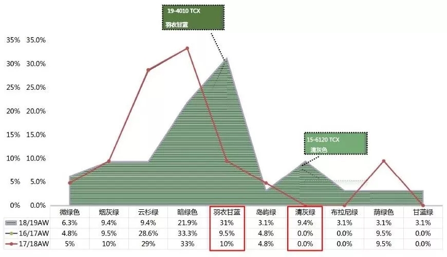
The main push color - feather blue
Green is an excellent cross-season color, and its earthy style is suitable for winter, while lighter attributes are preferred in summer. The vitality of the autumn/winter season in 18/19 is more natural and vibrant than in previous seasons, and it has the depth of rain and moisture. It also has versatility and is at the top of the neutral-fashion spectrum.
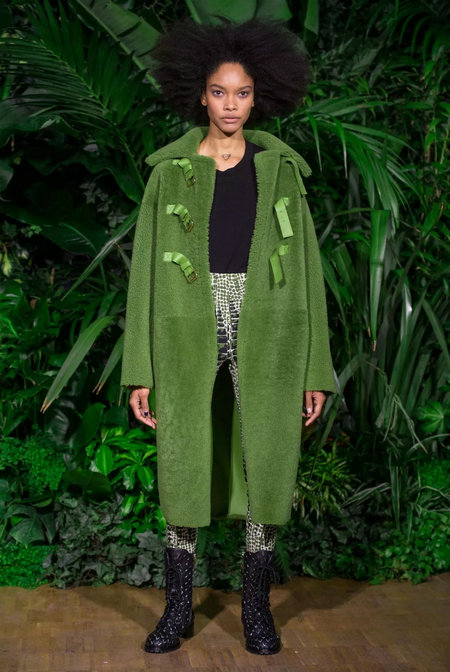
Vionnet
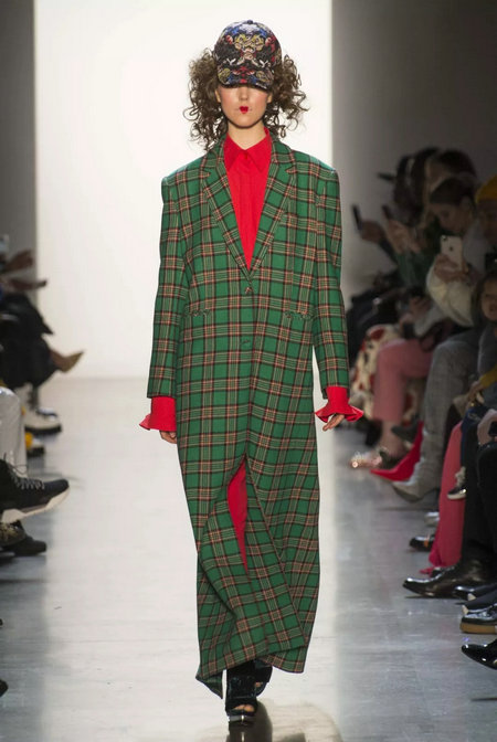
Concept Korea

M Missoni
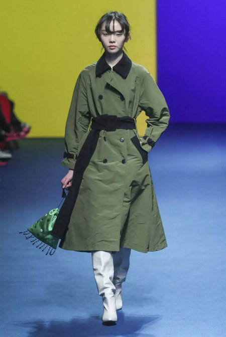
Fleamadonna
We are professional customized Die cast Keychain, such as metal alloy keychain, metal keyring, alloy key holder,hollow keychain, animal keychain, gold keychain, silver keychain, blank logo keychain, keychain metal, custom alloy keychain, fashion alloy keychain, cute keychain, soft Enamel Keychain, hard enamel keychain, epoxy coating keychain, offset Printing Keychain, etc.
The feature of this kind of keychain usually three-dimensional, so we can made of by zinc alloy material according to to craft unique. And to make the die cast keychain is more beautiful, we can plating color on the surface, such as gold, pearl gold, nickel, pearl nickel, black, rose gold, bronze, copper, antique silver and so on . It is can highlight your logo ,usually we use for souvenir gift ,toursit gift and so on.
Metal Keychain,Die Cast Keychain,Custom Logo Keychains,Logo Keychains
Shenzhen MingFengXing Art & Craft Products CO., LTD. , https://www.goodkeyring.com
